SoylentNews is people
SoylentNews
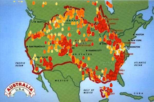
Which is larger? Yours, or mine? Australia or the United States of America, that is. With the bushfires in Australia out of control incinerating large swathes of the country a map was produced to visually depict how widespread the fires are. For emphasis the map was overlaid on top of America to give people an idea of the scope of the problem Australia is dealing with. Americans responded with disbelief that Australia was just as large as the USA. People were also in shock over how large an area, measured by size of US states, are currently burning. Responses on social media show how shocked and dumbfounded people were learning this.
- Area of Australia = 7.692 million km2
- Area of USA, excluding Alaska = 7.653 million km2
Here is the image under discussion.
This discussion has been archived.
No new comments can be posted.
Australian Bushfire Map Superimosed Over America Sows Disbelief
|
Log In/Create an Account
| Top
| 76 comments
| Search Discussion
The Fine Print: The following comments are owned by whoever posted them. We are not responsible for them in any way.
Logicians have but ill defined
As rational the human kind.
Logic, they say, belongs to man,
But let them prove it if they can.
-- Oliver Goldsmith
(Score: 5, Funny) by Nuke on Wednesday January 08 2020, @10:28AM (2 children)
I am reminded of Ronald Reagan's world map. California alone is about twenty times the size of Australia :-
https://www.davidrumsey.com/luna/servlet/detail/RUMSEY~8~1~292186~90064336:The-world-according-to-Ronald-Reaga [davidrumsey.com]
(Score: 2) by DannyB on Wednesday January 08 2020, @04:21PM (1 child)
Decades ago when I saw a version of Ronald Regan's world map, it had a spot in the icy north labeled "Palestinian Homeland (proposed)".
To transfer files: right-click on file, pick Copy. Unplug mouse, plug mouse into other computer. Right-click, paste.
(Score: 2) by Nuke on Wednesday January 08 2020, @07:23PM
The version I linked to does show that - on Svalbard by the look of it, or maybe simply on the icecap.