SoylentNews is people
SoylentNews
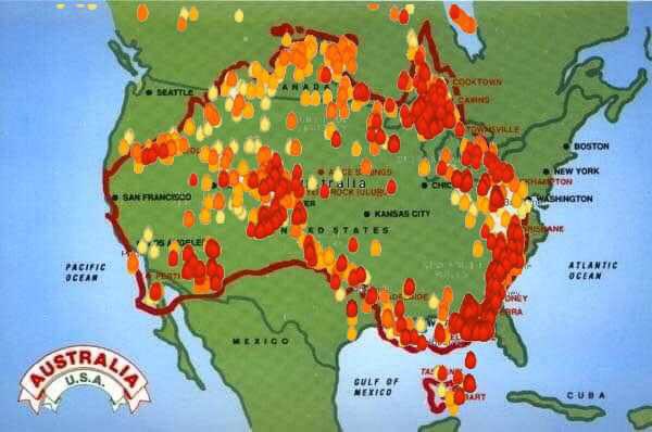
Which is larger? Yours, or mine? Australia or the United States of America, that is. With the bushfires in Australia out of control incinerating large swathes of the country a map was produced to visually depict how widespread the fires are. For emphasis the map was overlaid on top of America to give people an idea of the scope of the problem Australia is dealing with. Americans responded with disbelief that Australia was just as large as the USA. People were also in shock over how large an area, measured by size of US states, are currently burning. Responses on social media show how shocked and dumbfounded people were learning this.
- Area of Australia = 7.692 million km2
- Area of USA, excluding Alaska = 7.653 million km2
Here is the image under discussion.
This discussion has been archived.
No new comments can be posted.
Australian Bushfire Map Superimosed Over America Sows Disbelief
|
Log In/Create an Account
| Top
| 76 comments
| Search Discussion
The Fine Print: The following comments are owned by whoever posted them. We are not responsible for them in any way.
Whenever I feel like exercise, I lie down until the feeling passes.
(Score: 4, Funny) by VLM on Wednesday January 08 2020, @01:02PM
Gen-Xers and boomers have "Crocodile Dundee" movies to remind them of Australia.
Younger folks only have Steve Irwin and depressingly he died like 15 years ago.
The best Australia has today is David Jones the EE blogger. EE stuff typically causes instant vaginal dryness among roughly 50% of the population, unlike crocodile dundee in the 80s, so naturally this is going to impact survey results when only people who know how to properly set base bias current in each transistor of a class B bipolar transistor amplifier have even heard of Australia in the last decade or so.