SoylentNews is people
SoylentNews
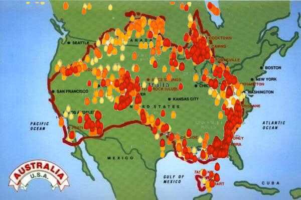
Which is larger? Yours, or mine? Australia or the United States of America, that is. With the bushfires in Australia out of control incinerating large swathes of the country a map was produced to visually depict how widespread the fires are. For emphasis the map was overlaid on top of America to give people an idea of the scope of the problem Australia is dealing with. Americans responded with disbelief that Australia was just as large as the USA. People were also in shock over how large an area, measured by size of US states, are currently burning. Responses on social media show how shocked and dumbfounded people were learning this.
- Area of Australia = 7.692 million km2
- Area of USA, excluding Alaska = 7.653 million km2
Here is the image under discussion.
This discussion has been archived.
No new comments can be posted.
Australian Bushfire Map Superimosed Over America Sows Disbelief
|
Log In/Create an Account
| Top
| 76 comments
| Search Discussion
The Fine Print: The following comments are owned by whoever posted them. We are not responsible for them in any way.
Most of our lives are about proving something, either to ourselves or to
someone else.
(Score: 3, Insightful) by hendrikboom on Thursday January 09 2020, @03:46AM (1 child)
Some years ago my wife and I subscribed to two Montreal newspapers -- an English-language one (the Gazette) and a French-language one (Le Devoir). We noticed that the difference between the two local newspapers wasn't just language. They reported different news.
(Score: 2) by kazzie on Friday January 10 2020, @08:22AM
On a similar note, in the 1960s/70s, my grandfather (living in north-west Wales) had two television antennas on his house: one for watching BBC news, the other for Irish news.