SoylentNews is people
SoylentNews
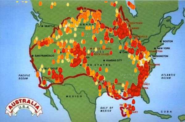
Which is larger? Yours, or mine? Australia or the United States of America, that is. With the bushfires in Australia out of control incinerating large swathes of the country a map was produced to visually depict how widespread the fires are. For emphasis the map was overlaid on top of America to give people an idea of the scope of the problem Australia is dealing with. Americans responded with disbelief that Australia was just as large as the USA. People were also in shock over how large an area, measured by size of US states, are currently burning. Responses on social media show how shocked and dumbfounded people were learning this.
- Area of Australia = 7.692 million km2
- Area of USA, excluding Alaska = 7.653 million km2
Here is the image under discussion.
This discussion has been archived.
No new comments can be posted.
Australian Bushfire Map Superimosed Over America Sows Disbelief
|
Log In/Create an Account
| Top
| 76 comments
| Search Discussion
The Fine Print: The following comments are owned by whoever posted them. We are not responsible for them in any way.
The answer to the question of Life, the Universe, and Everything is...
Four day work week,
Two ply toilet paper!
(Score: 2) by Runaway1956 on Thursday January 09 2020, @02:40PM
Geography, shmeography. See how old I am - born in 1956. I, and a handful others, learned how to read maps, how big the world is, and all sorts of good stuff. MOST of my classmates couldn't be assed to remember which states bordered our own state, or which countries border the US, or even which hemisphere the US is in.
Don't blame the crappy school system, and don't blame millenials, or Gen X'rs, or whatever. On average, Americans have always been geographic idiots. Well, always for all of my life, at least.
Maybe they need to start drawing maps like the really old-time people. Maps with sea serpents and dragons on them, and mythical creatures captured my imagination first. As I matured, I realized all of that was make believe, but maps were still fascinating.